

A Responsive
E-commerce Website
Background
Mirror is a global clothing store started back in 1994 and it has over 400 physical stores in 32 countries, selling a very wide range of styles of clothing with affordable price.
They currently are willing to update and reinvent their online platform to stay competitive in the market trend.
Goals
-
To design a new logo that attracts a wide range of target group
-
To design an e-commerce platform with easy and pleasurable shopping experience for customers
My Roles
UX Designer.
Engaged on process of the design, from research to usability testing and further iterations.
Tools Used
Sketch, Adobe Illustrator, Adobe Photoshop, Invision, Zepplin
Design Process

Research
Competitive Analysis
Interviews
Persona
Empathy Mapping
Storyboard

Information
Architecture
Card Sorting
Sitemap
Sketches

Interaction
Design
Task Flow
User Flow
Wireframes
Responsive Wireframes
Low Fidelity Prototype

User Interface
Design
Brand & Identity
Style Tile
Responsive UI Design
UI Kit

Iteration &
Implementation
High Fidelity Prototype
Usability Test
Affinity Map
Design Iteration
1. Research
To understand what needs to be done, we conducted some research to understand users’ pain points and unmet needs. We started with a competitor analysis to find out what are the strengths and weaknesses of both direct and indirect competitors in their e-commerce platforms.
1on1 interviews were followed after the competitor analysis to gain deeper empathy. We had 5 participants interviewed about their latest online shopping experience.
Research Summary
4 out of 5 interview participants shop online at least once fortnightly and use their mobile phones to shop. The males shop based on their needs while the females are easily driven to shop by promotion.
The main reasons of shopping online are:
convenience - lower price - wider range of product availability - product reviews
“Trying clothes in store takes so much effort”
“Customers’ reviews help me in making decision”
Pain Points
-
No instant checkout
-
Delivery charge and time
-
Size inconsistency
-
Inaccurate product photo and description
-
Return and exchange policy
-
Inconsistent promotion
Unmet Needs
-
Receiving good products as described
-
Receiving product on time
-
Easy and quick checkout
Based on the research findings, both Persona, Empathy Map and Storyboard were created.
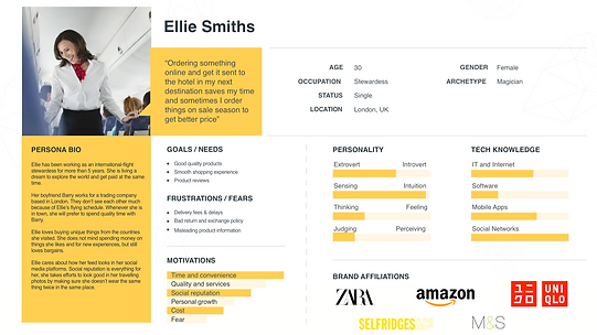
Persona
Ellie is a 30-year-old flight attendance who spends most of her time travelling around the world. She hardly has the time to go to the shops and she is relying her self on e-commerce site to get her shoppings done.
Empathy Map
Empathy map helps us to understand the persona’s emotional values in shopping online.


Storyboard
The storyboard was created to understand the persona’s experience in certain action.
Card Sorting Findings
2. Information Architecture
A card sorting exercise was done to understand how users are going to navigate the site. From there, we can clearly see the direction on how categorisation works.
8 people participated in the card sorting exercise using 30 cards via OptimalSort.
-
75% of the participants categorised the items into this groups: Accessories, Dresses, Outwears, Sandal & Shoes, Tops, Bottoms and Skirt
-
7 out of 8 participants grouped items into Accessories
-
2 categories were created based on the items’ materials: Cotton and Denim/Jeans
-
3 categories were created based on the style: Formal, Feminine and Sporty
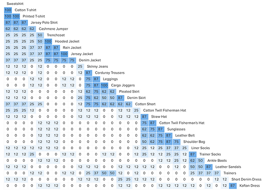
Based on the cards used for sorting and the findings, we created a site map to structure the site.

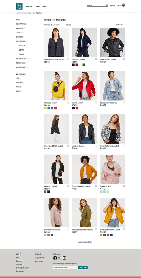
3. Interaction Design
We started the interaction design process with creating the happy path for a particular task to provide the most intuitive interaction of the website. It came out as the form of a task flow and a user flow. The site map from previous section and the user flow were then translated into low-fidelity responsive wireframes as an initial design of the website.
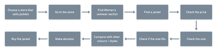
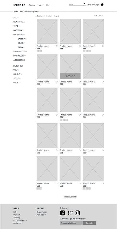
Task Flow
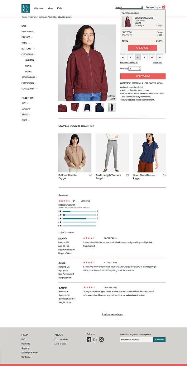
The task flow of buying a jacket.
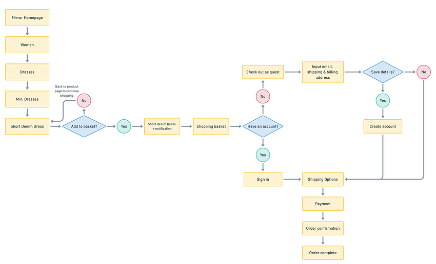
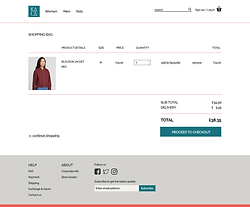
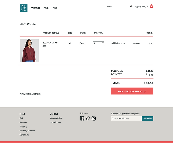
User Flow
The user flow of buying a short denim dress.
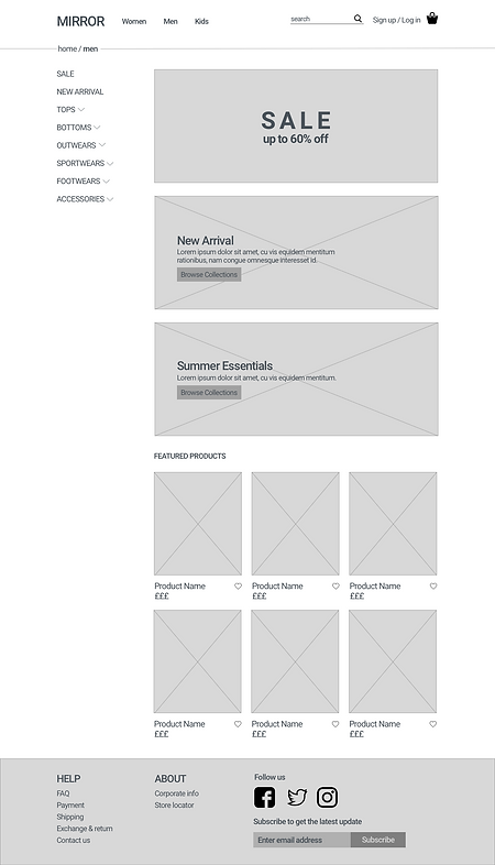
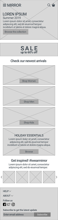
Low Fidelity Wireframes for Desktop

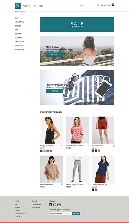
User Interface

Responsive Wireframes
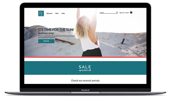
The wireframes of the homepage for desktop, tablet and mobile.


4. User Interface Design
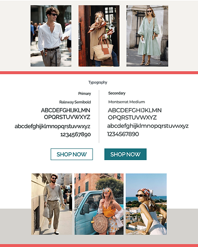
Once the low fidelity wireframes were completed and tested, we moved on to visual design. We created a new face for Mirror in this stage by giving it a brand new name, logo and colours.
There are a few keywords that we came out for the brand personality:
clean - modern - chic - fresh - neutral - consistent - comfortable - reliable - quality - affordable
Mirror was then re-branded to KACA, which means glass in Indonesian.
MIRROR GLASS KACA

Style Tile

User Interface


UI Kit

5. Iteration & Implementation
As the design was done, we started the testing phase by performing a usability test on the high fidelity prototype. This allowed us to receive feedbacks from the users, which we created an affinity map from. This process helped us to sort, prioritise and rank the feedback and the revisions that would follow.
Usability Testing Overview
-
4 participants, 1 was a participant from the previous research
-
2 tests in-person, 1 test remote via Google Meeting, 1 test via screen recording
-
Aged range 25-35
-
100% of the participants were able to complete the task
-
Each participant took the average of 2 minutes to complete the task
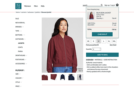
Task To Complete
-
To buy red blouson jacket size M
Findings
-
Overall design is good and easy to navigate
-
2/4 of the participants tried to search for the item
-
2/4 of the participants tried to select the colour on the sub-category page
-
All participant clicked on the product image when selecting the item
-
1 participant tried to type in the quantity in the box given
-
All participant selected colour, size and quantity before adding the item into shopping bag
-
All participant easily found the shopping bag notification and clicked Checkout
-
1 participant expected the drop down menu to appear on hover and clicking will direct user to category page
Affinity Map

From the usability testing findings, there are some design iterations needed to be done (in order of priority):
-
Enable picking colour from sub-category page
-
Make the default quantity to 1 to save one click
-
Balance out the layout of the footer
-
Change the colour of bag icon when an item is added
-
Change the primary CTA buttons (add to bag, checkout and proceed to checkout) to red
Visual Design Iterations
Before (left) and After (right)


Reflection
I have never thought the design process could be so interesting. I learned a lot during the process, especially in research, empathising and design patterns. I believe there are still a lot to learn and improve for the next project.
Other Case Study